We have been connected with PROLAN for a long time - a webdesign career started there and we have been allowed to do small jobs for PROLAN from the beginning. Also sometimes bigger matters, like their website. The company exists since 1995, as does the logo. The logo has an emotional value for the founders and was not to be changed for a quite a while. Now there was a major administrative transformation last year: there was a change in the management. Now the company is managed by one of the original founders and a new managing director. Also the positioning is developing: other services are being offered - others are being dropped, in short: the PROLAN company is transforming. This too should now become visible.
Design Development
Logo
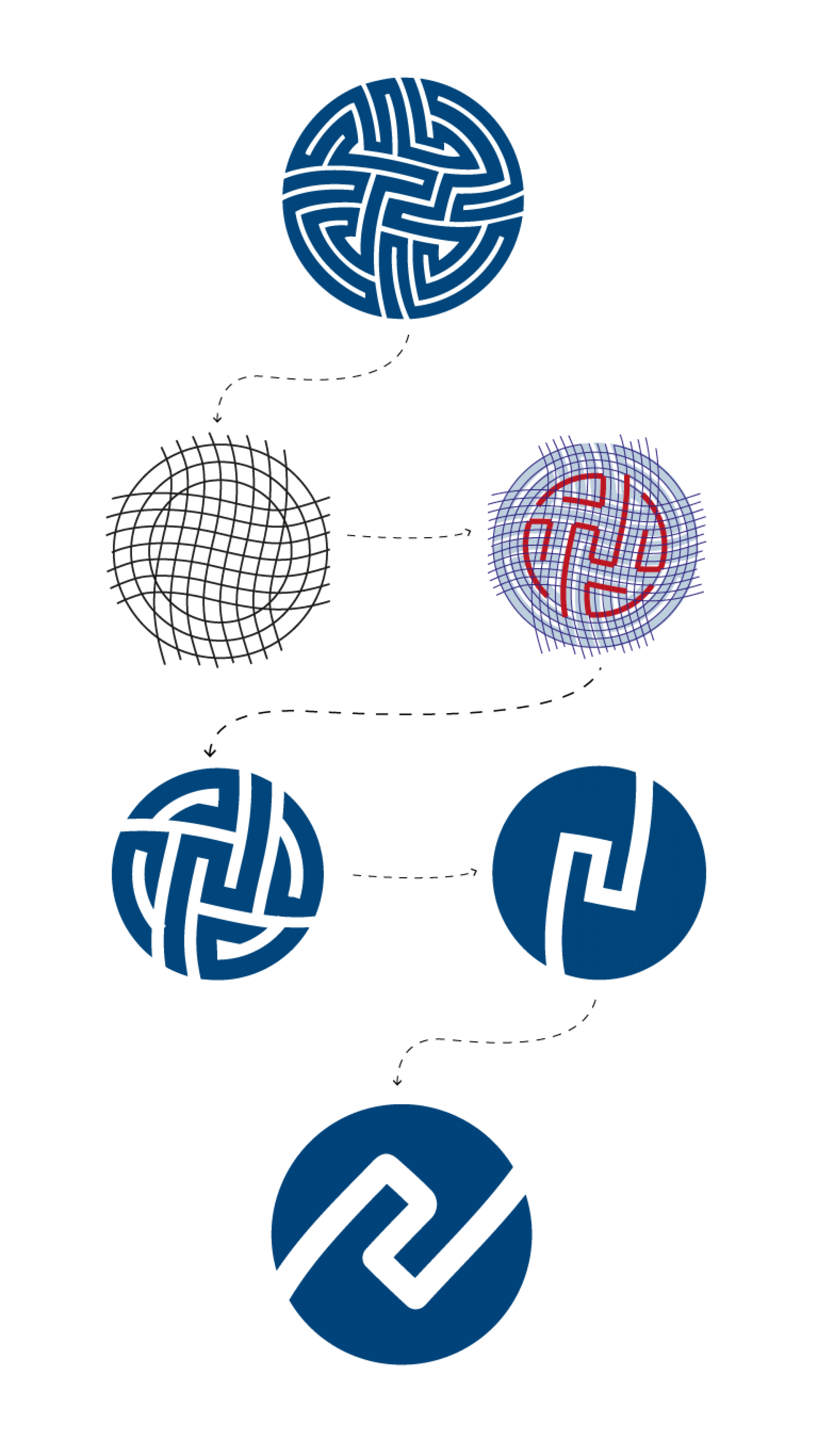
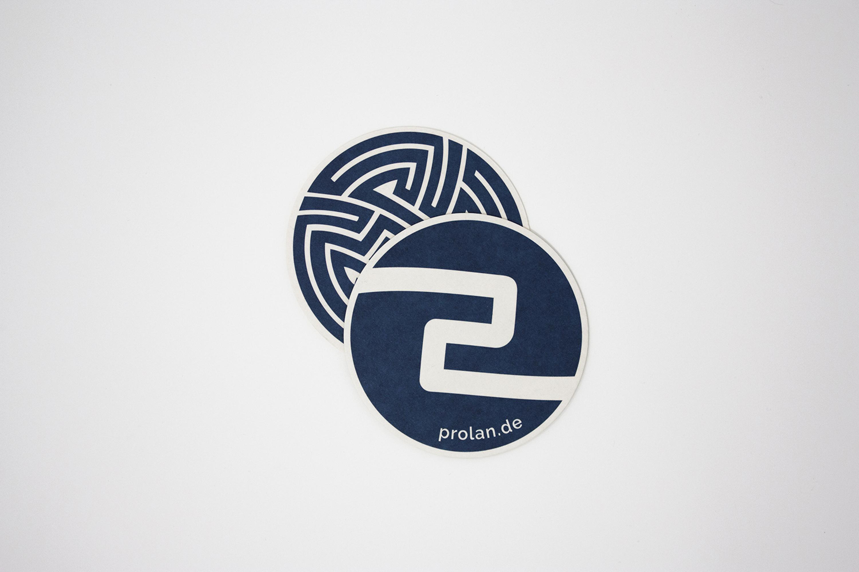
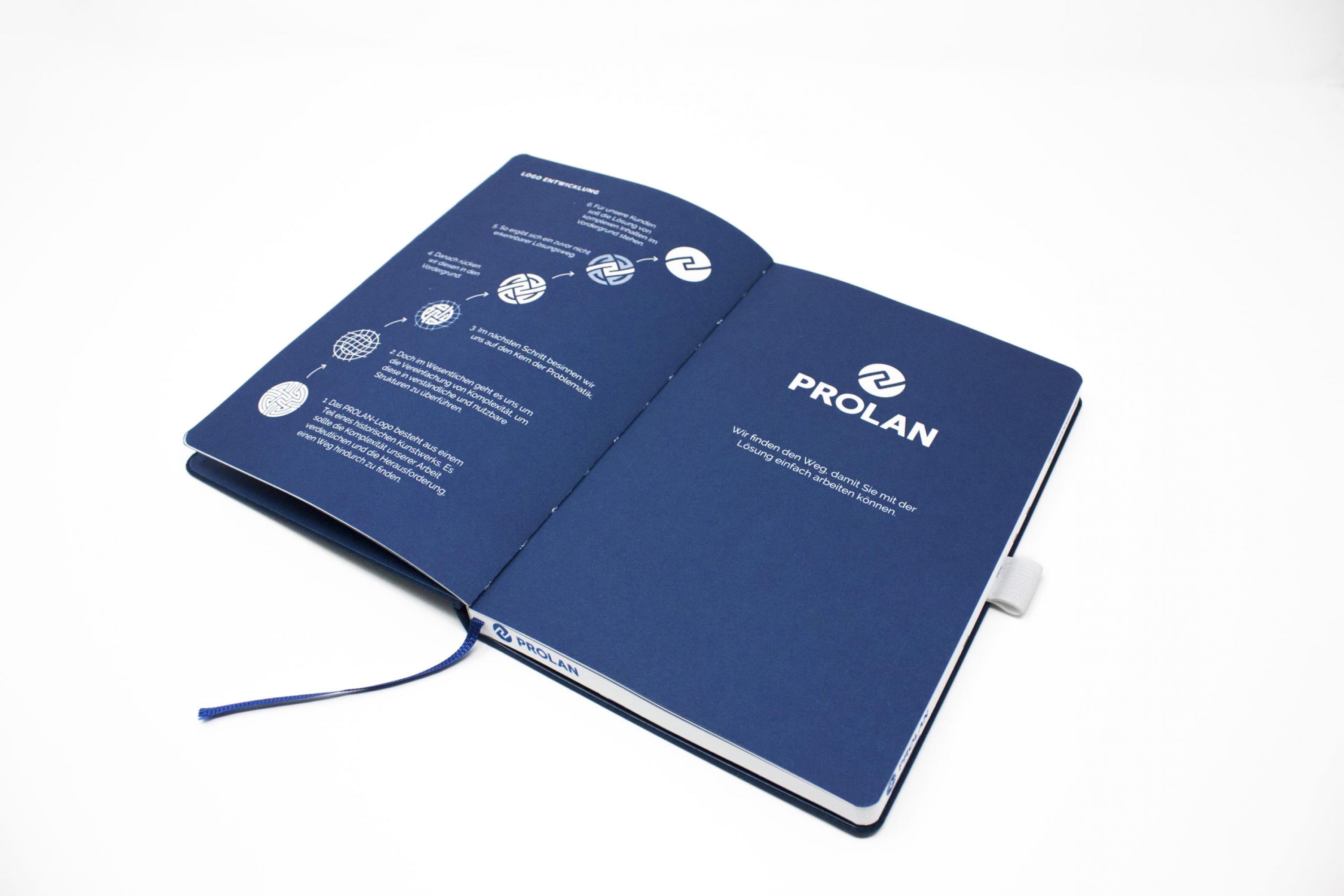
The originally complex and intertwined logo of PROLAN has its origin in a labyrinth – it symbolises the complexity of It-systems. But in fact it is the simplification of complexities that PROLAN wants to offer its customers. And so the logo has also been further developed: The complex path has become a simplified path – there is still a curve, as a symbol for the process you always have to go through, but from which you simply find your way.
Webdesign for PROLAN
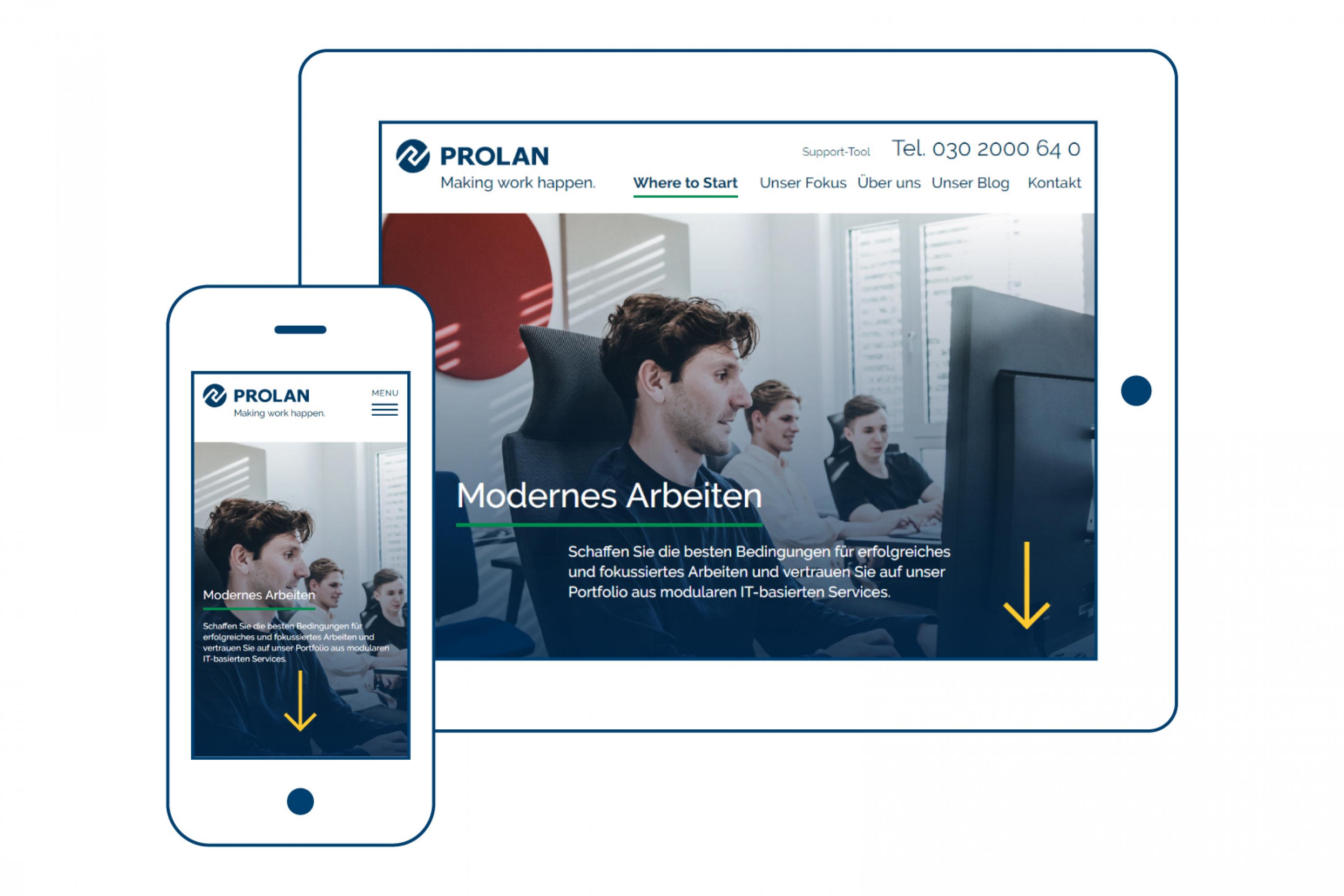
When redesigning the website for PROLAN Datensysteme GmbH, there were many different points to consider. In a workshop with the client we worked out the primary focus of the entire website: Making (digital) work possible.
With this goal in mind, we started with the complete restructuring of all content and individual pages. A revised sitemap and optimized information architecture is the result.
Redesign of the business cards
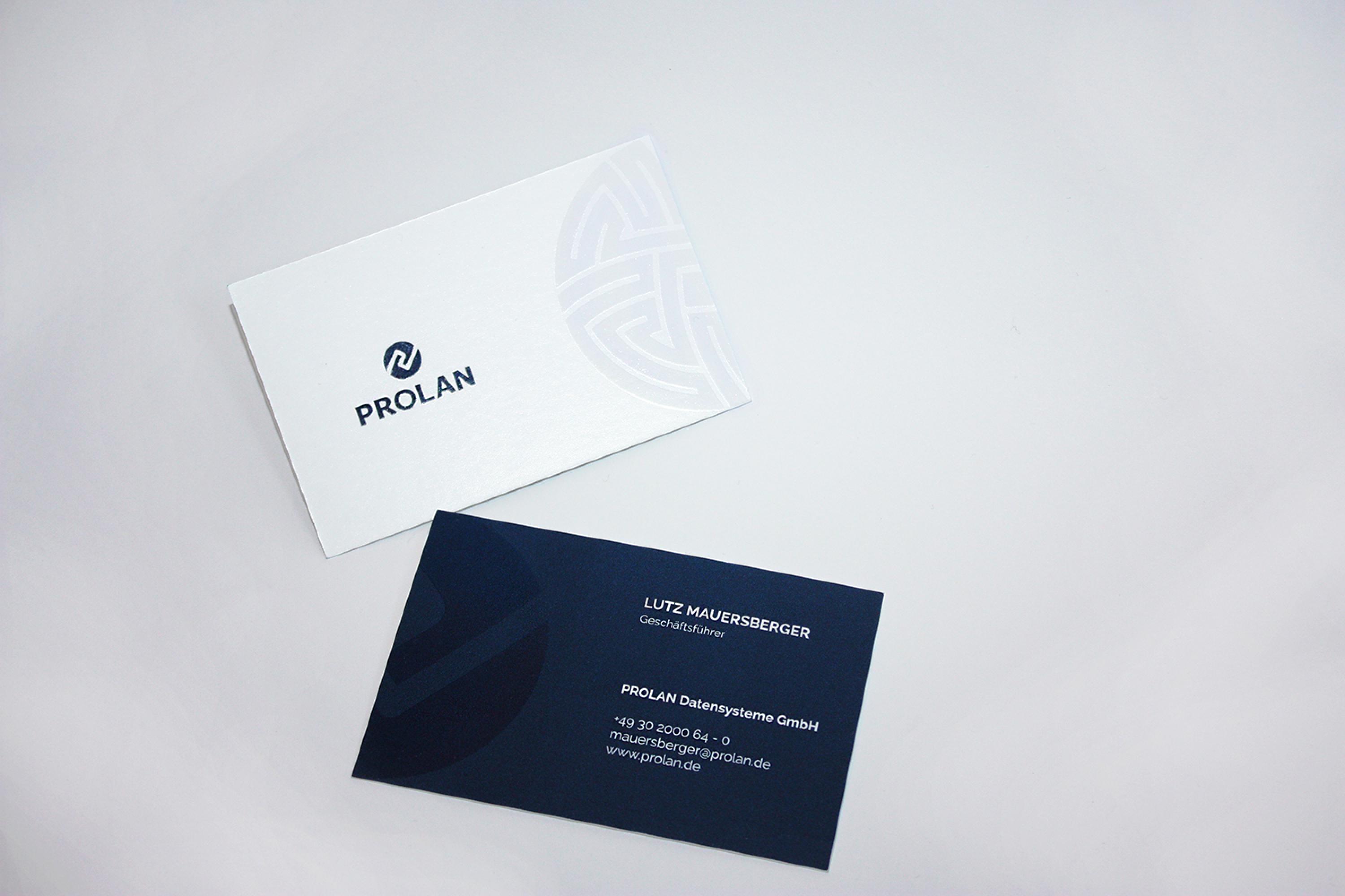
In the process of rebranding, we also redesigned the business cards for PROLAN. The business cards are very minimalist - white on the one side and blue on the other. The highlight, however, are the two secondary design elements resulting from the old and new logo. These two design elements were applied to the business card with a partial gloss varnish, so that the finesse is only noticed when looking at it more closely. The refined interplay of simplicity and refinement gives the business cards a very special and high-quality character.
Branded Espresso
As a thank you for the good partnership, we had espresso cups with the PROLAN logo printed on them.
Notepads with a Branded Color Cut
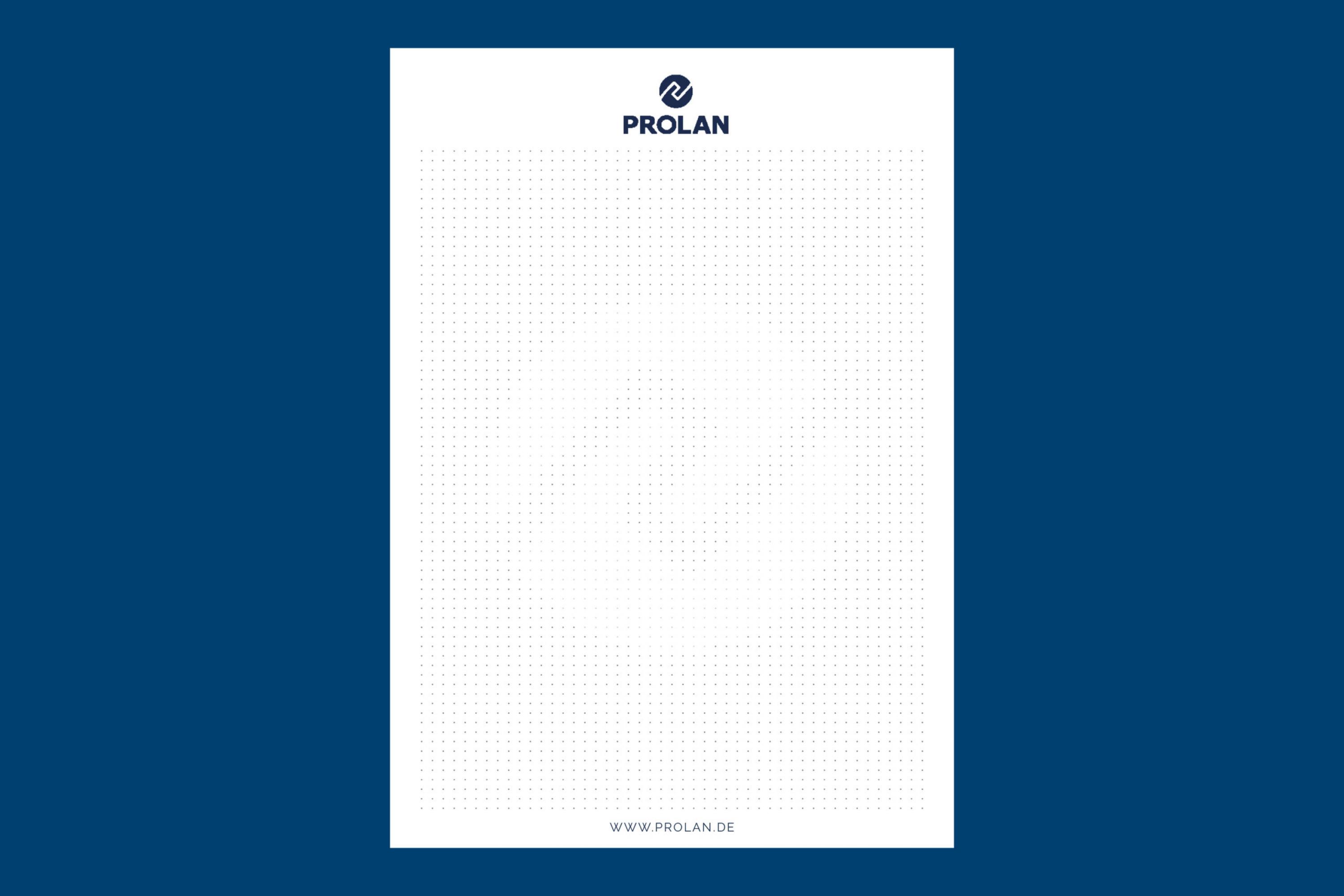
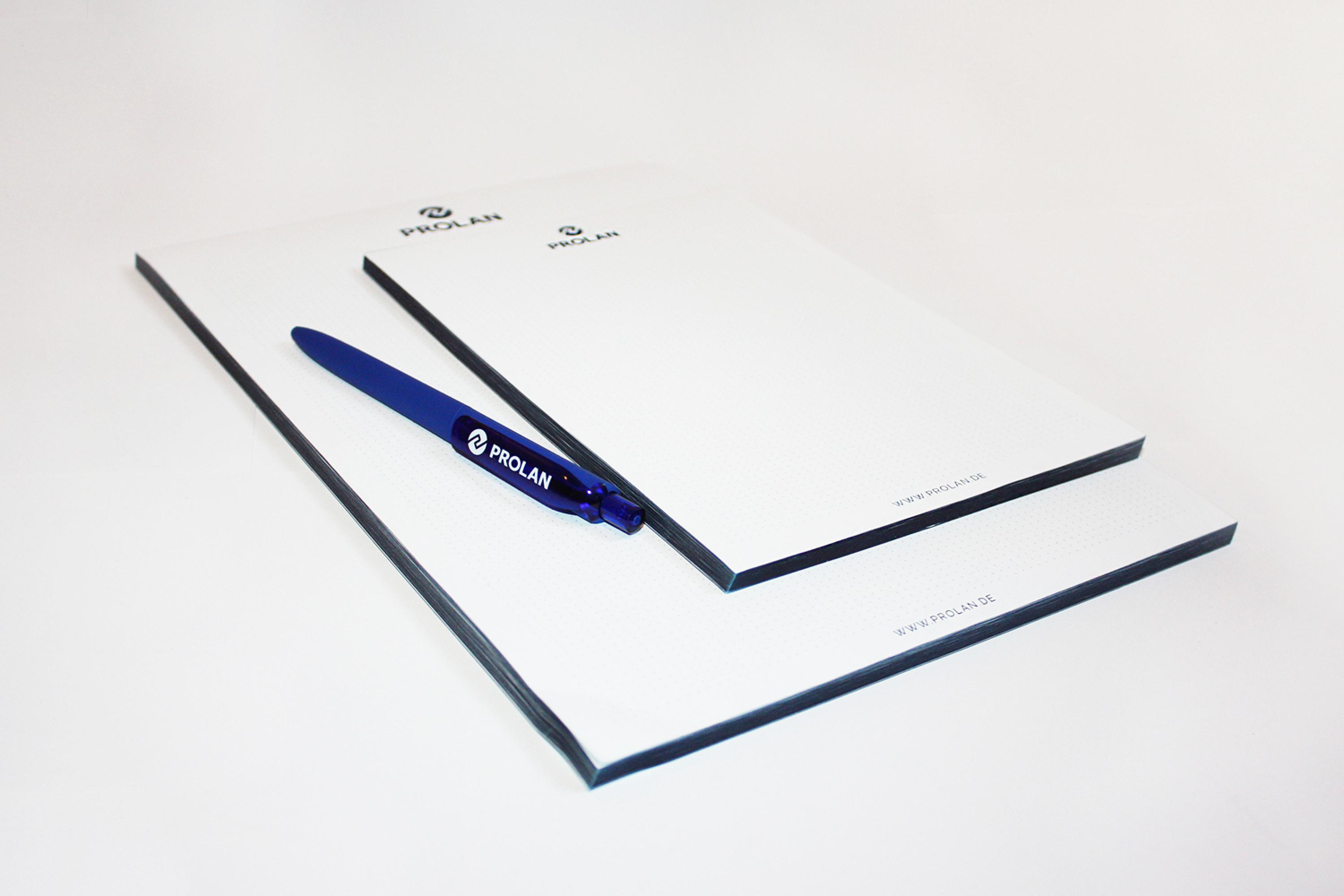
During the re-branding process we also designed notepads in two sizes, A4 and A5, for PROLAN. The entire pads were printed in the corporate blue of the company – the logo, the web address and also the dot matrix. A real eye-catcher of the pads is of course the dark blue colour, which enhances the pads even more.
Here, too, a small detail is built in that only becomes apparent at second glance: The logo's sign was incorporated into the grid by means of dots of varying brightness.
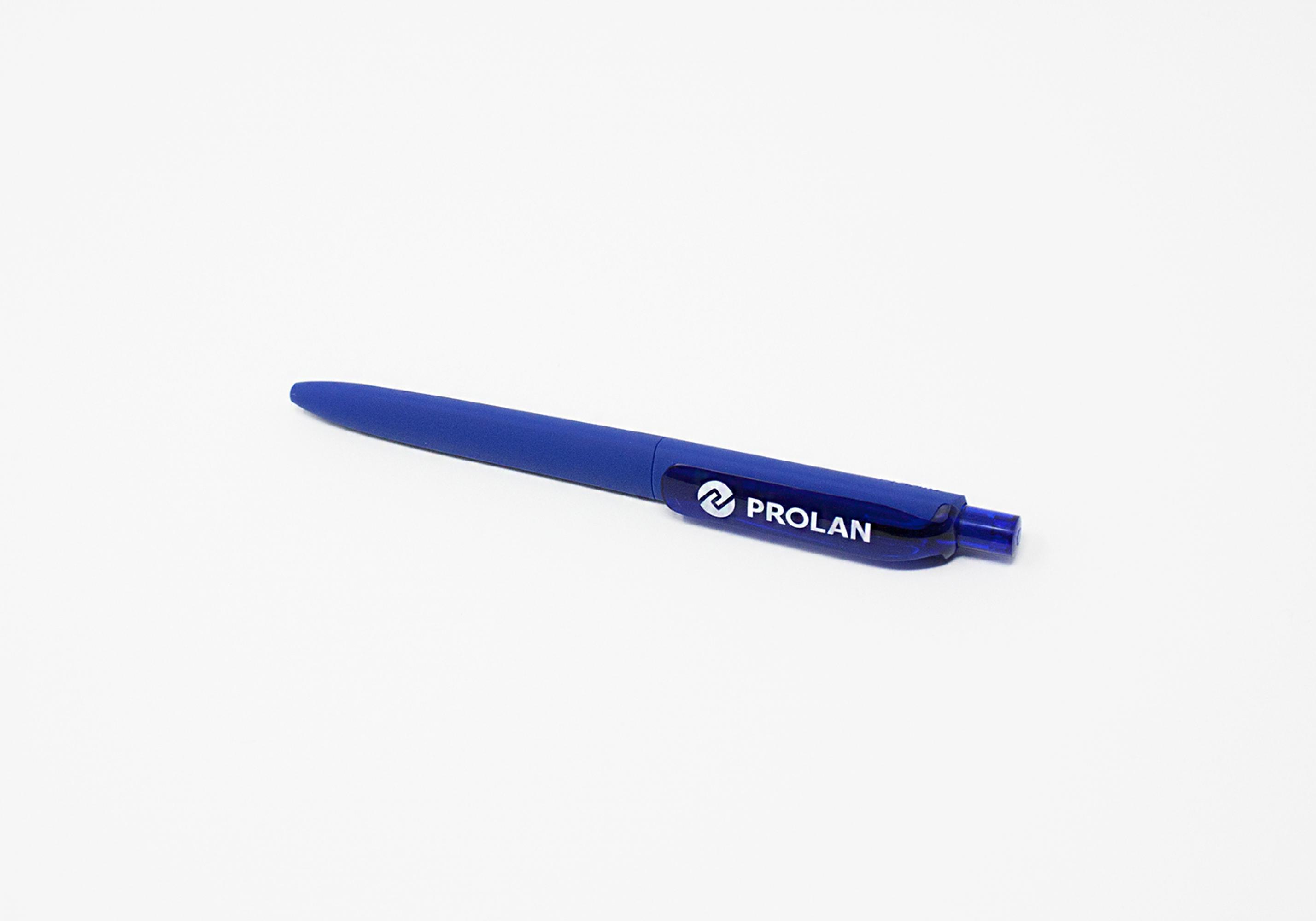
Merchandise for Employees and Customers
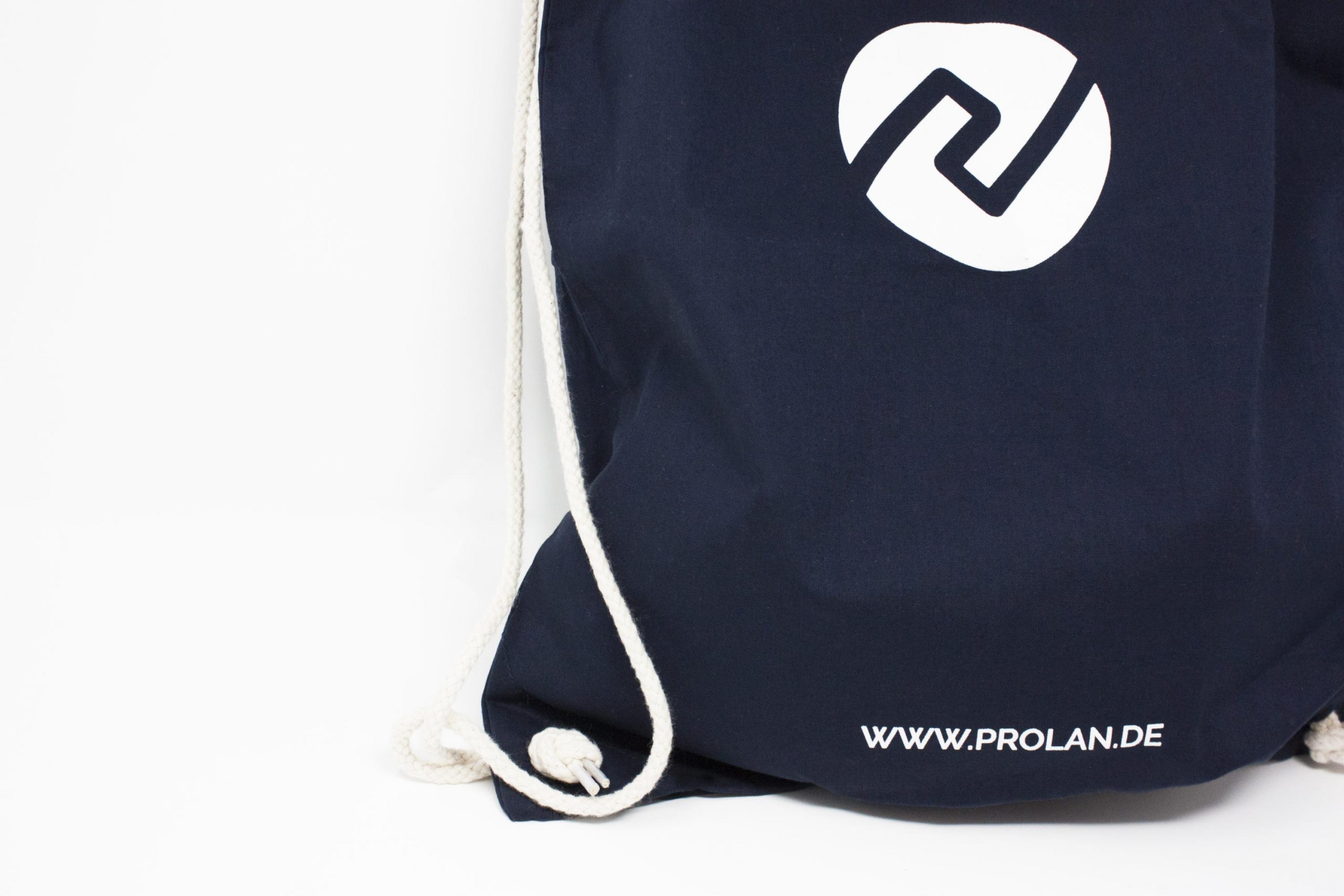
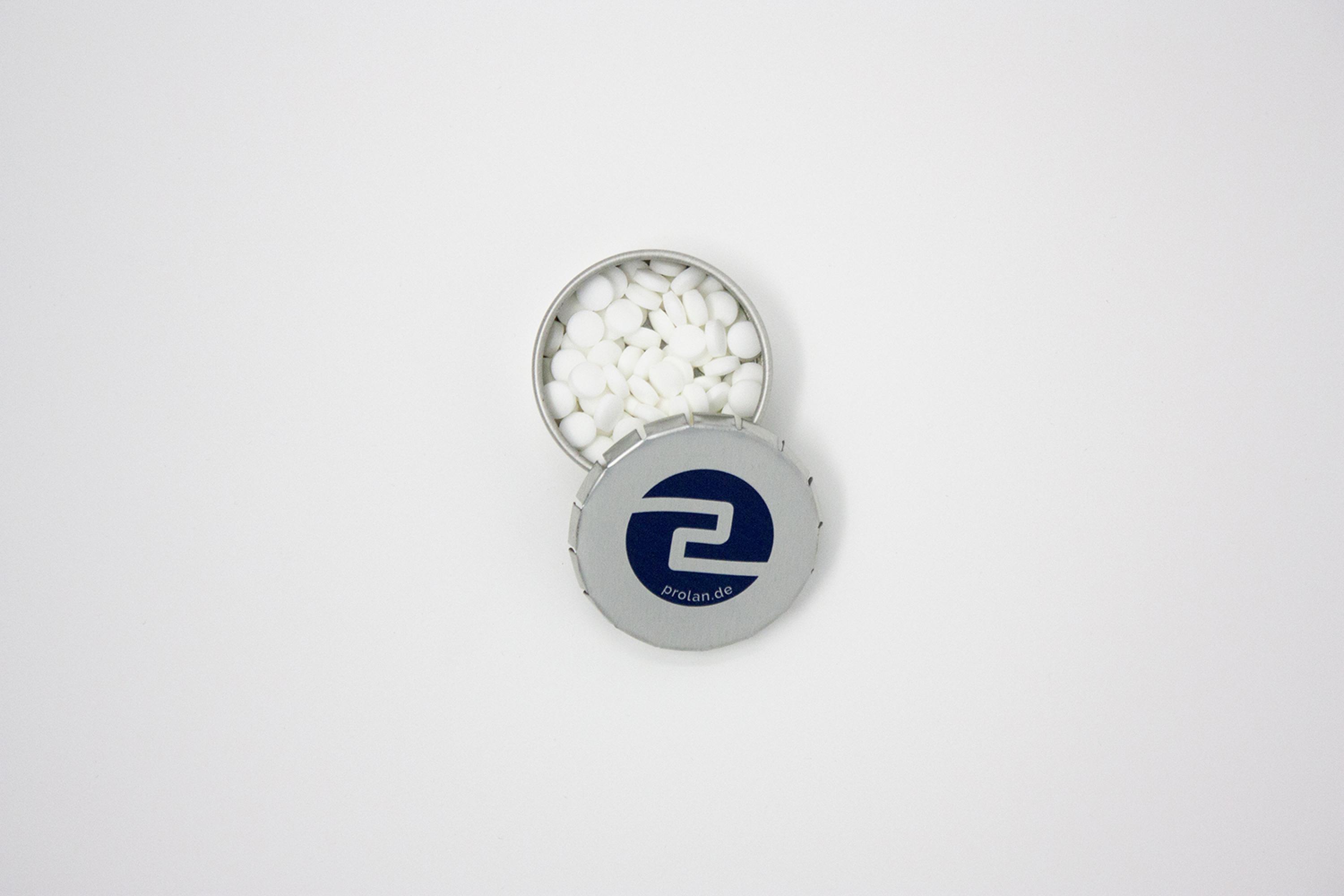
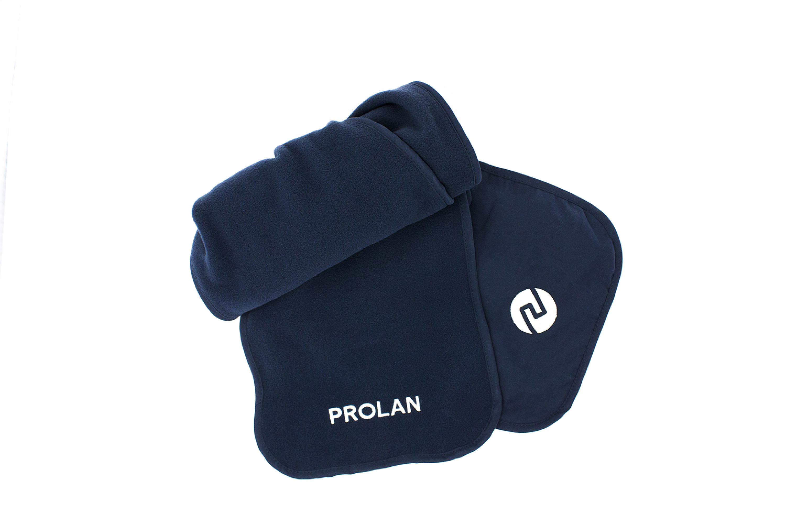
Handouts for New Customers
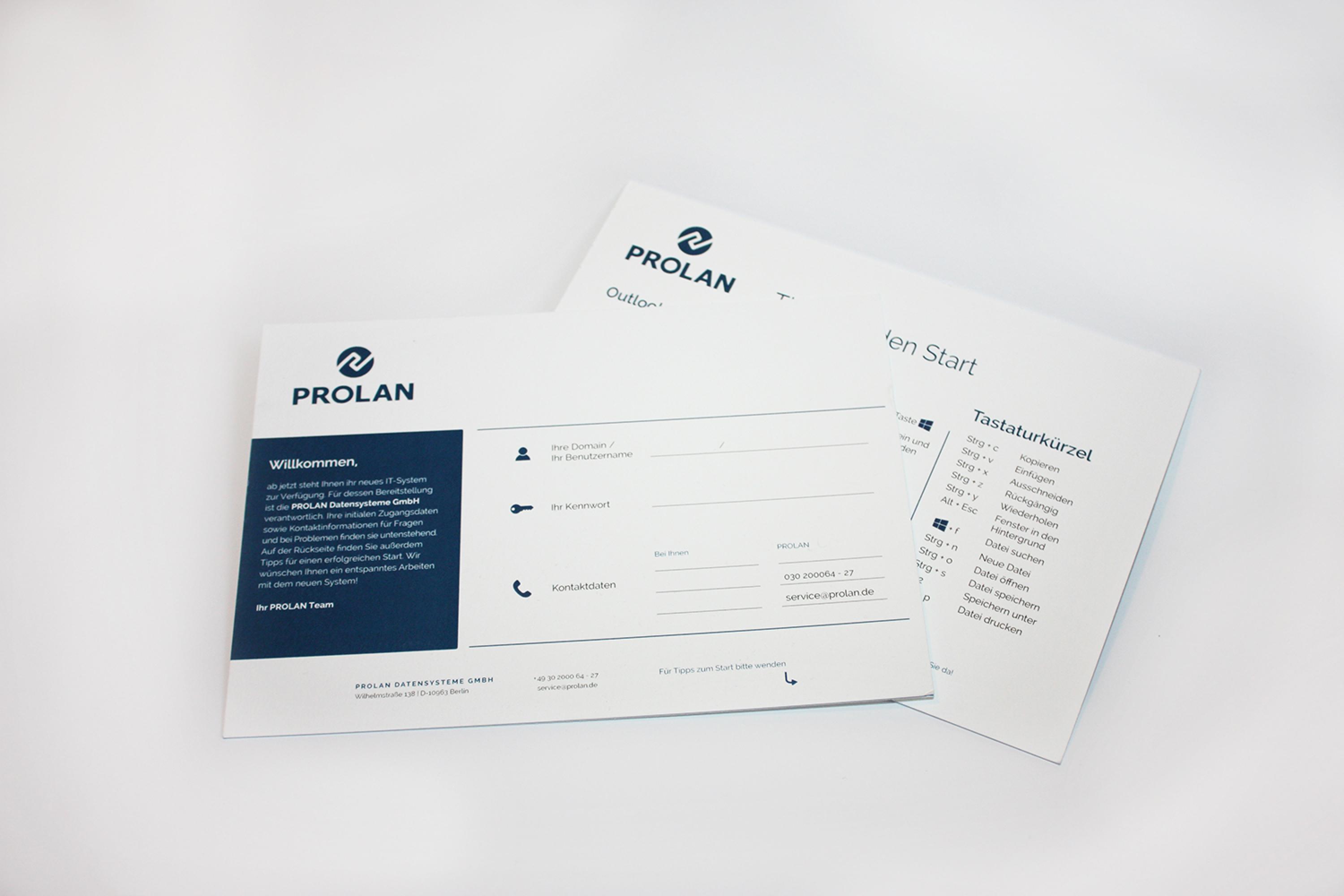
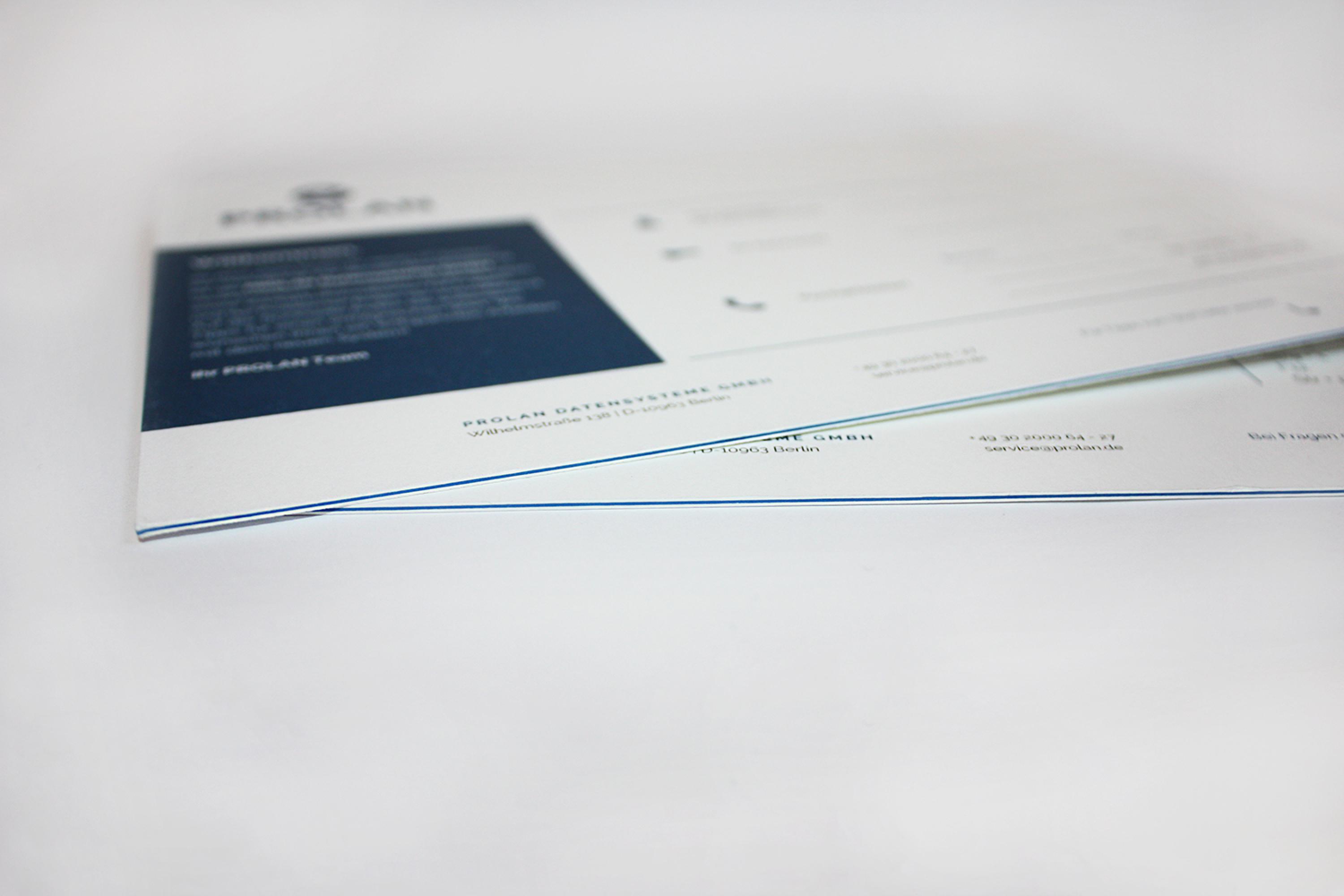
For PROLAN's new customers, we have designed a handout to help them get to know PROLAN for the start of the project. It contains information about PROLAN and a number of helpful tips. The handout is printed on a high quality and thicker paper and has a blue colour core, which makes the card even more valuable.
High Quality Folders
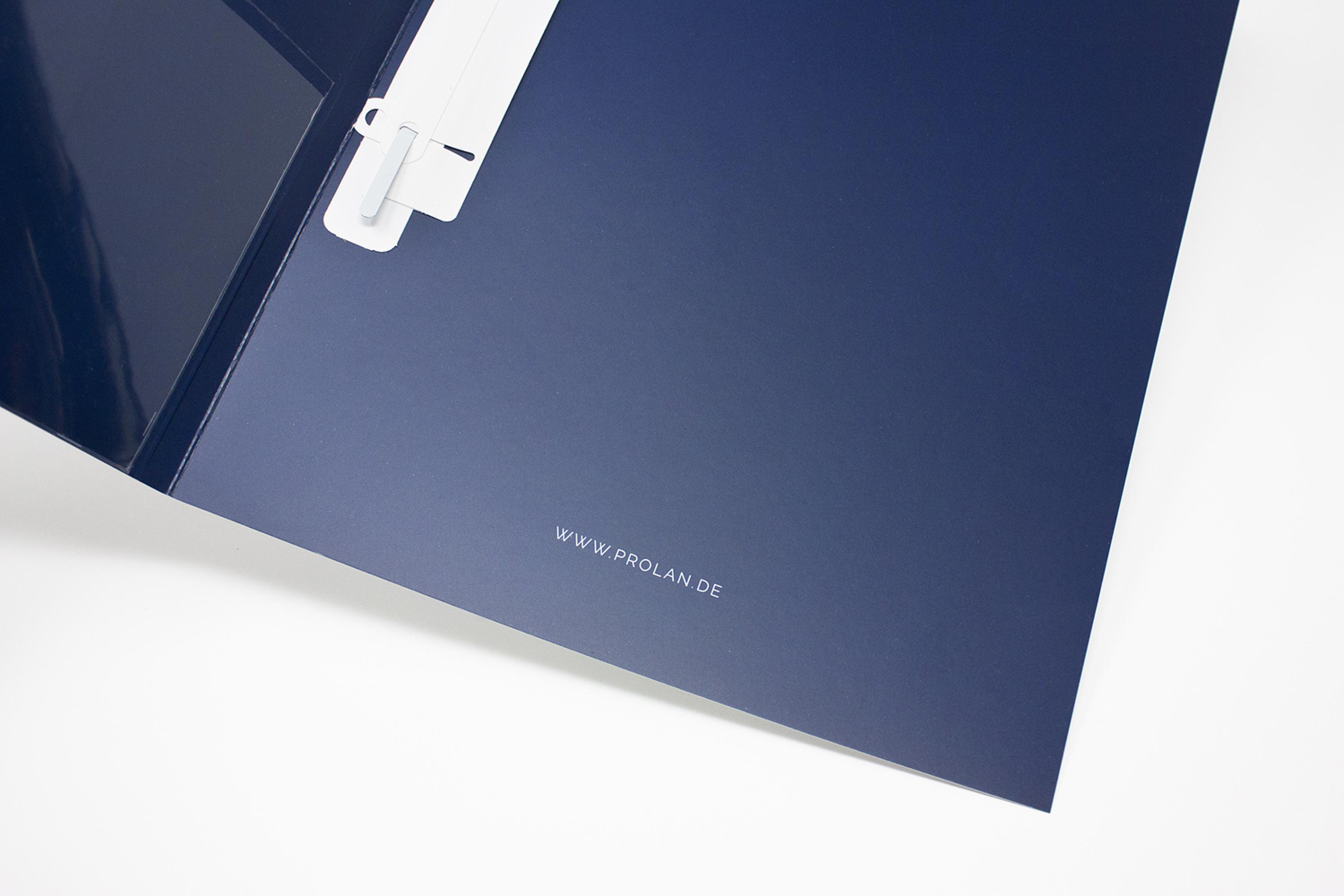
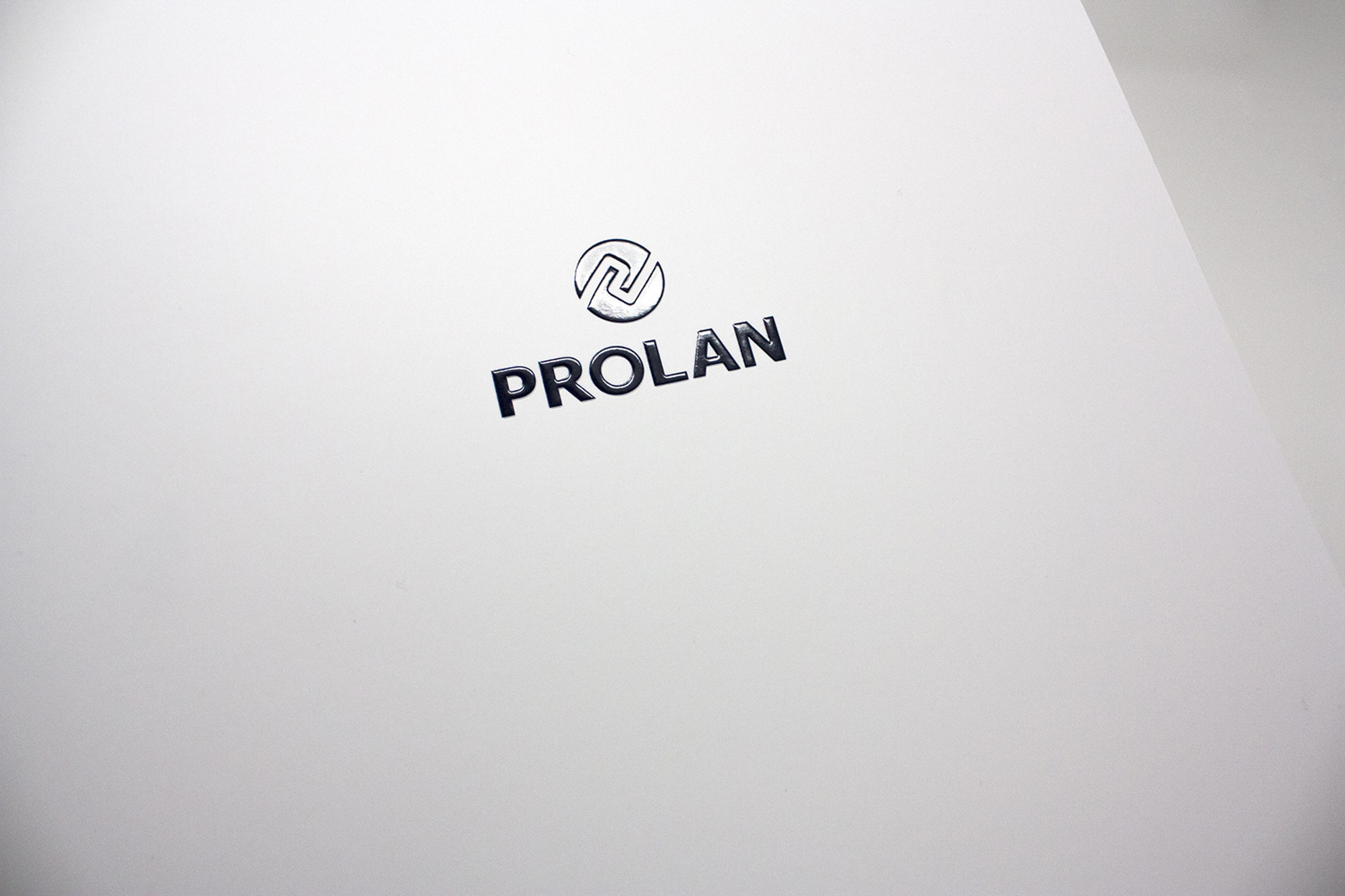
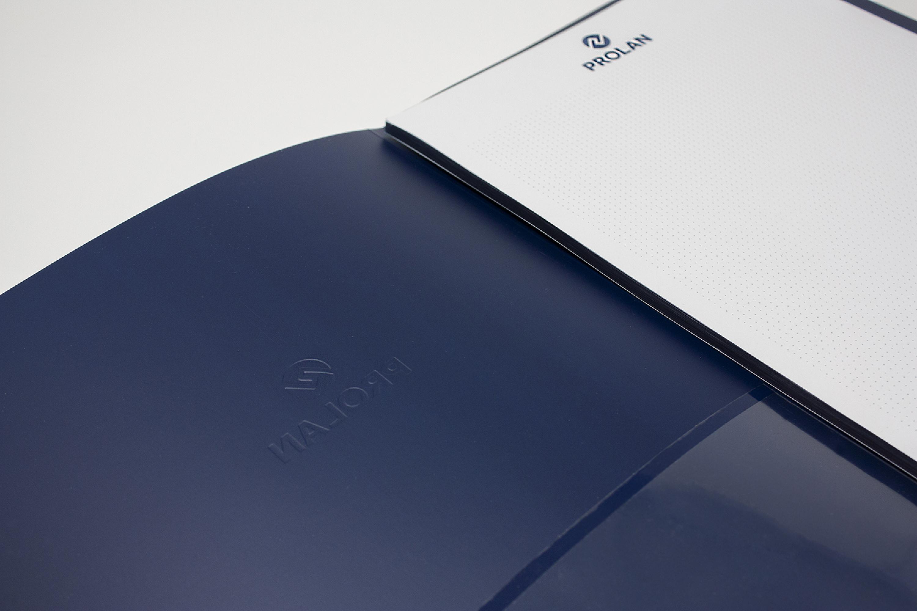
We have already designed many communication and advertising materials for PROLAN. Besides business cards, stationery, handout and much more, we have also designed folders. The presentation folders are completely blue on the inside and have a compartment to store business cards or flyers. The logo on the outside has been embossed and covered with a partial varnish, which gives the folders a high quality character.
High-Quality Brandbooks for the Employees
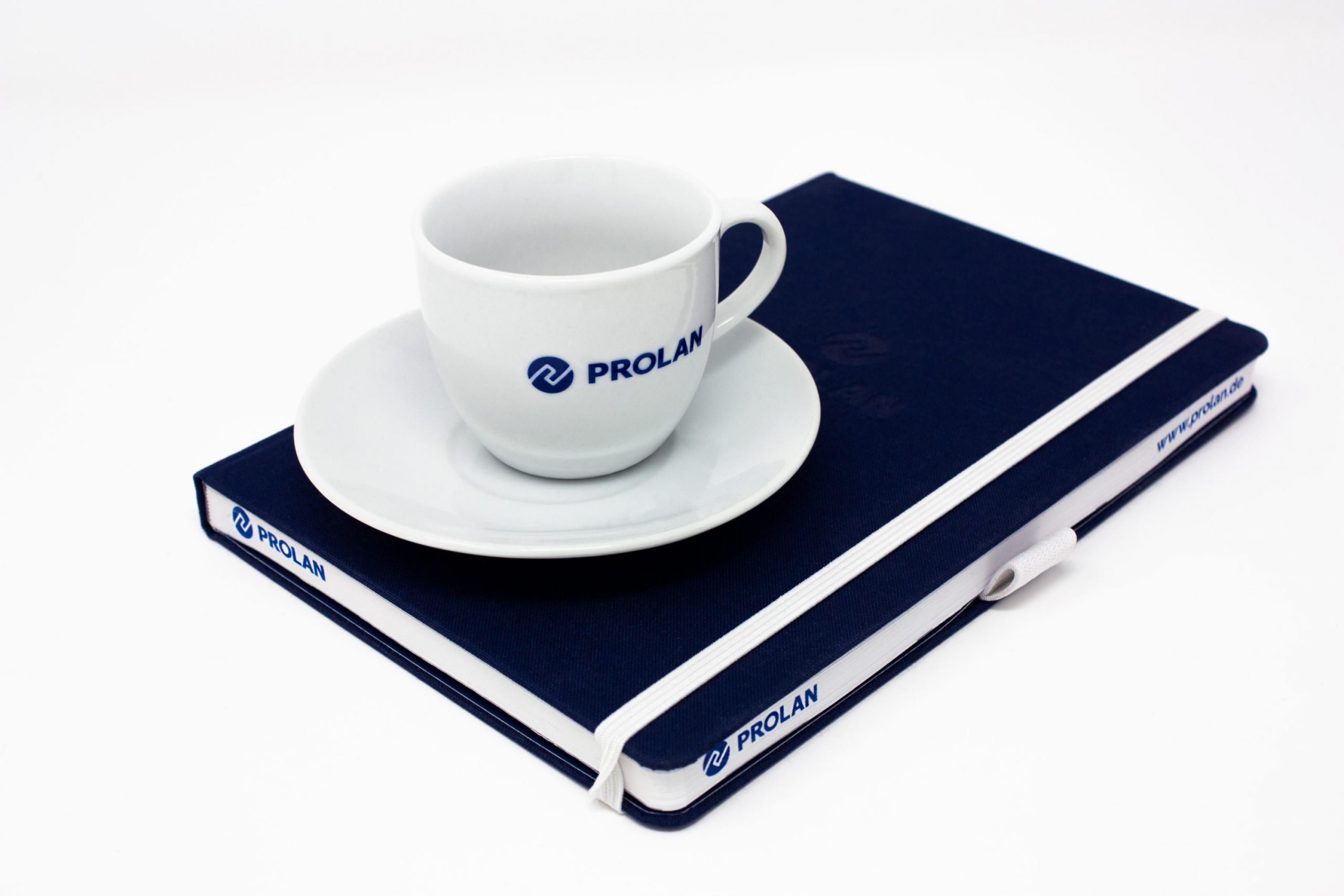
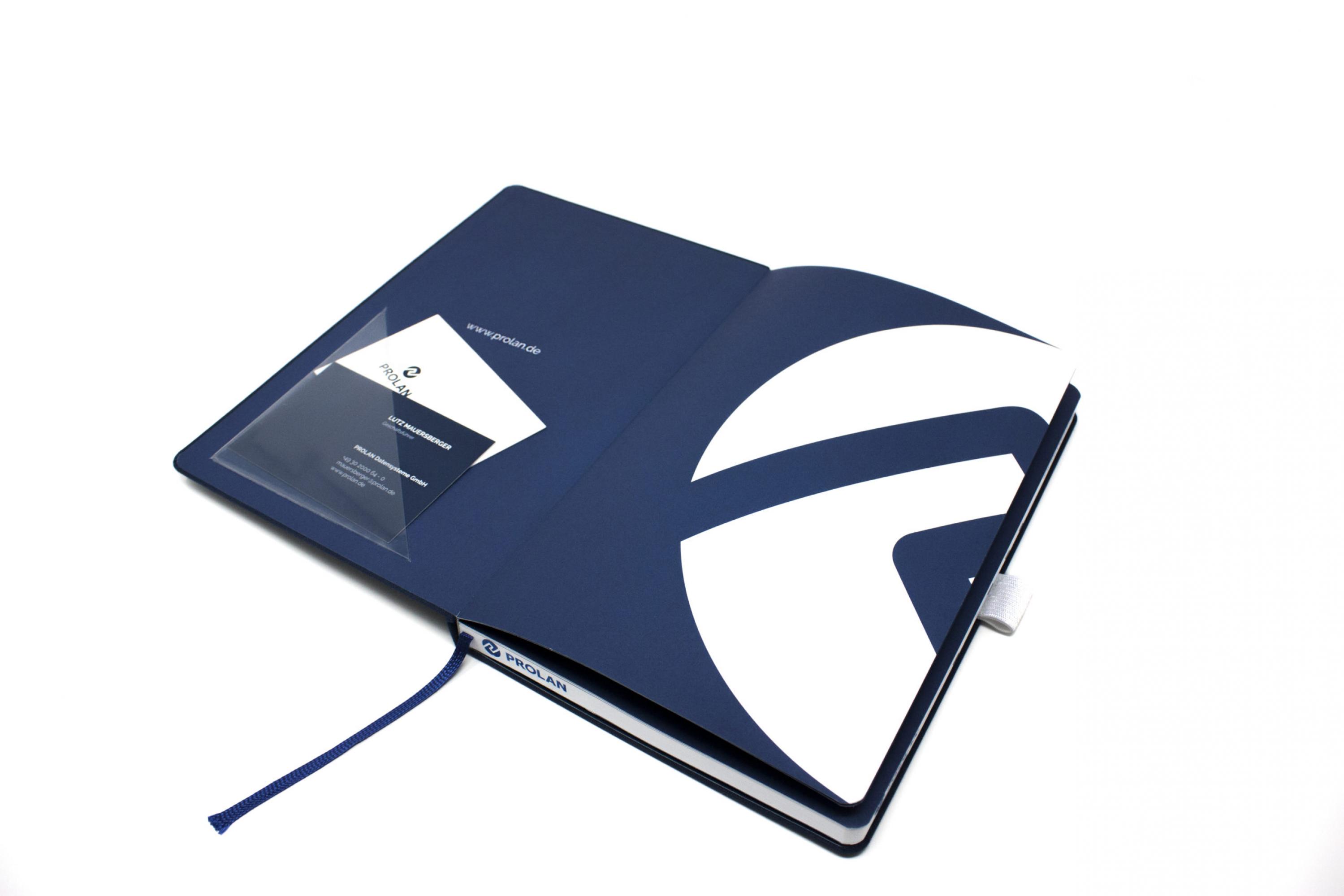
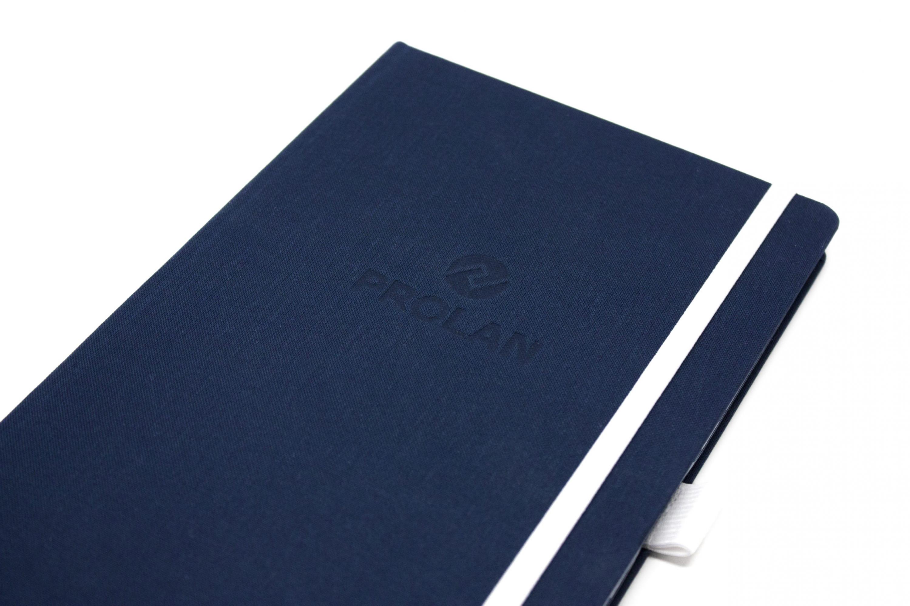
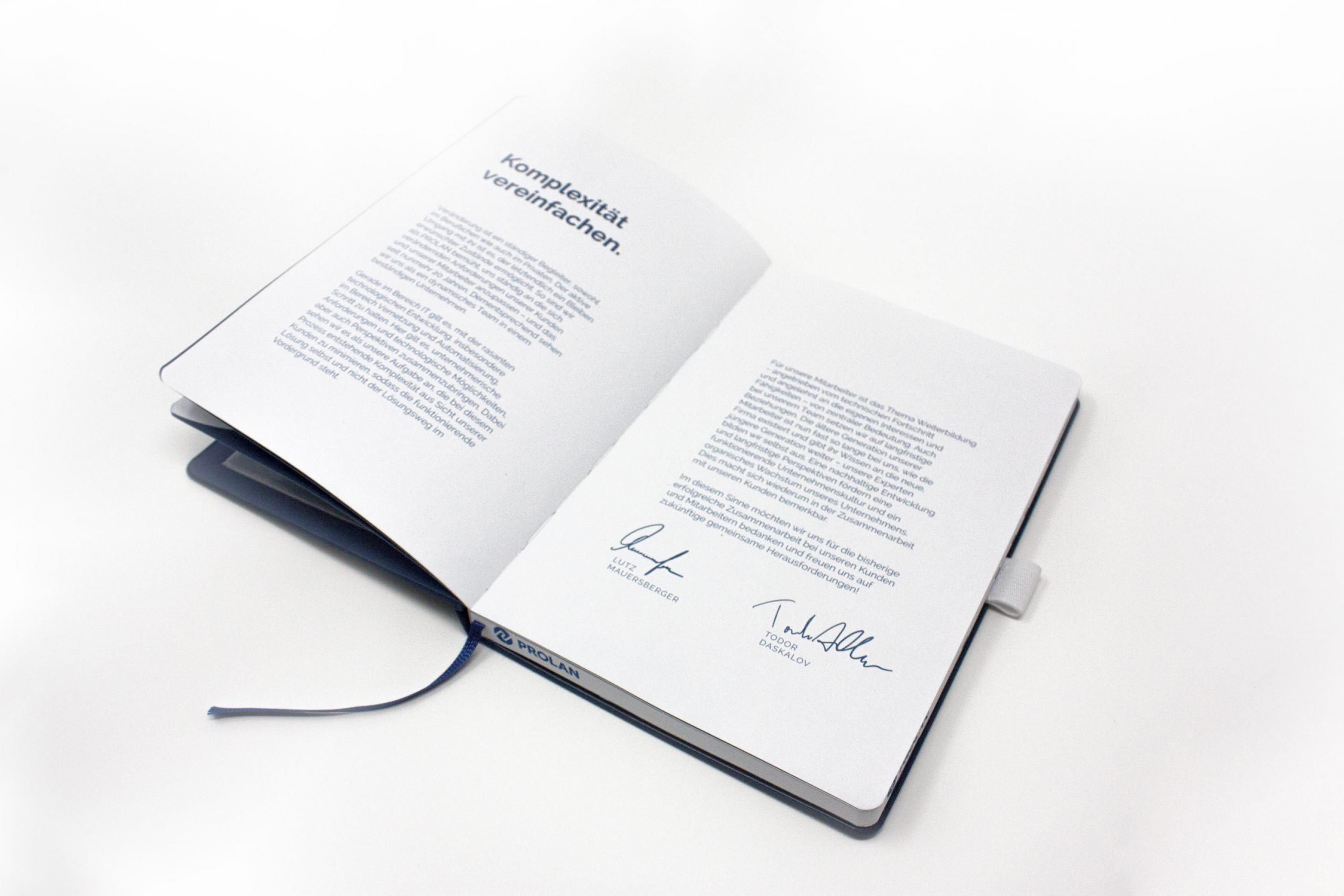
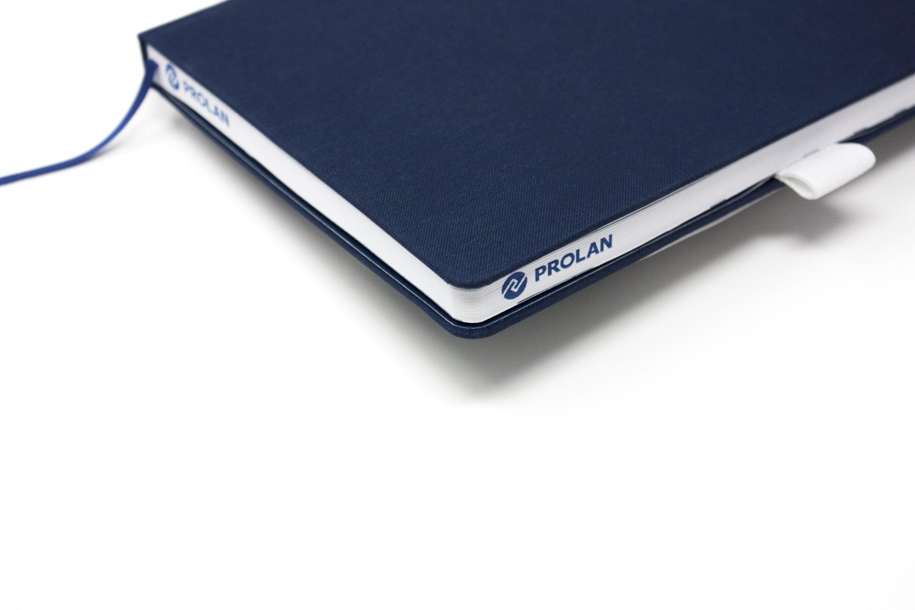
To top off the rebranding, PROLAN employees were given a brand book – a notebook containing the brand story and the development of the logo and its justifications. The notebook also contains a calendar and has a cloth cover including an embossed logo. In addition, the company logo is printed on the edge of the book pages.
The book was distributed at a kick-off weekend together with other merchandising items such as gym bags, scarves and caps.
Christmas Cards
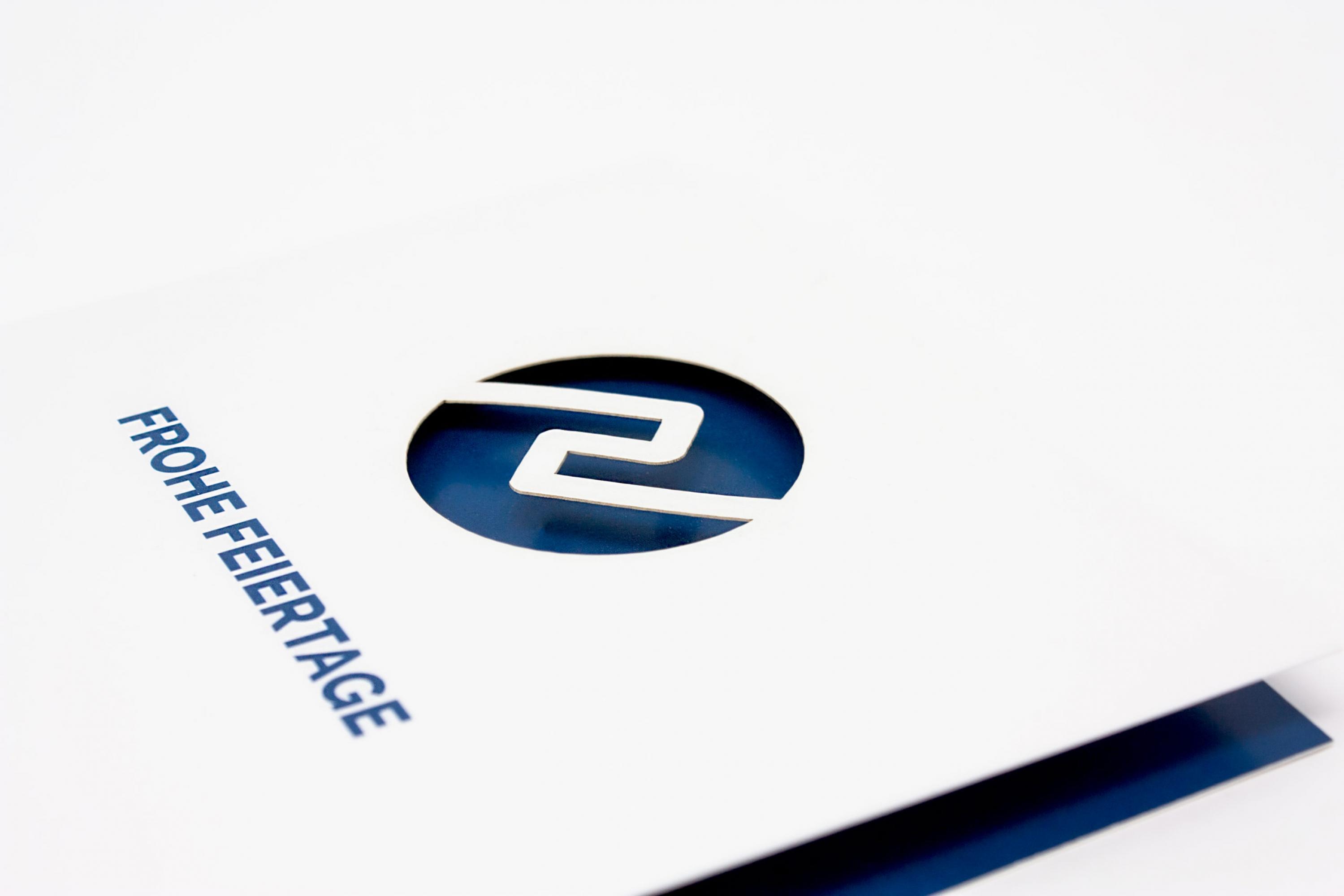
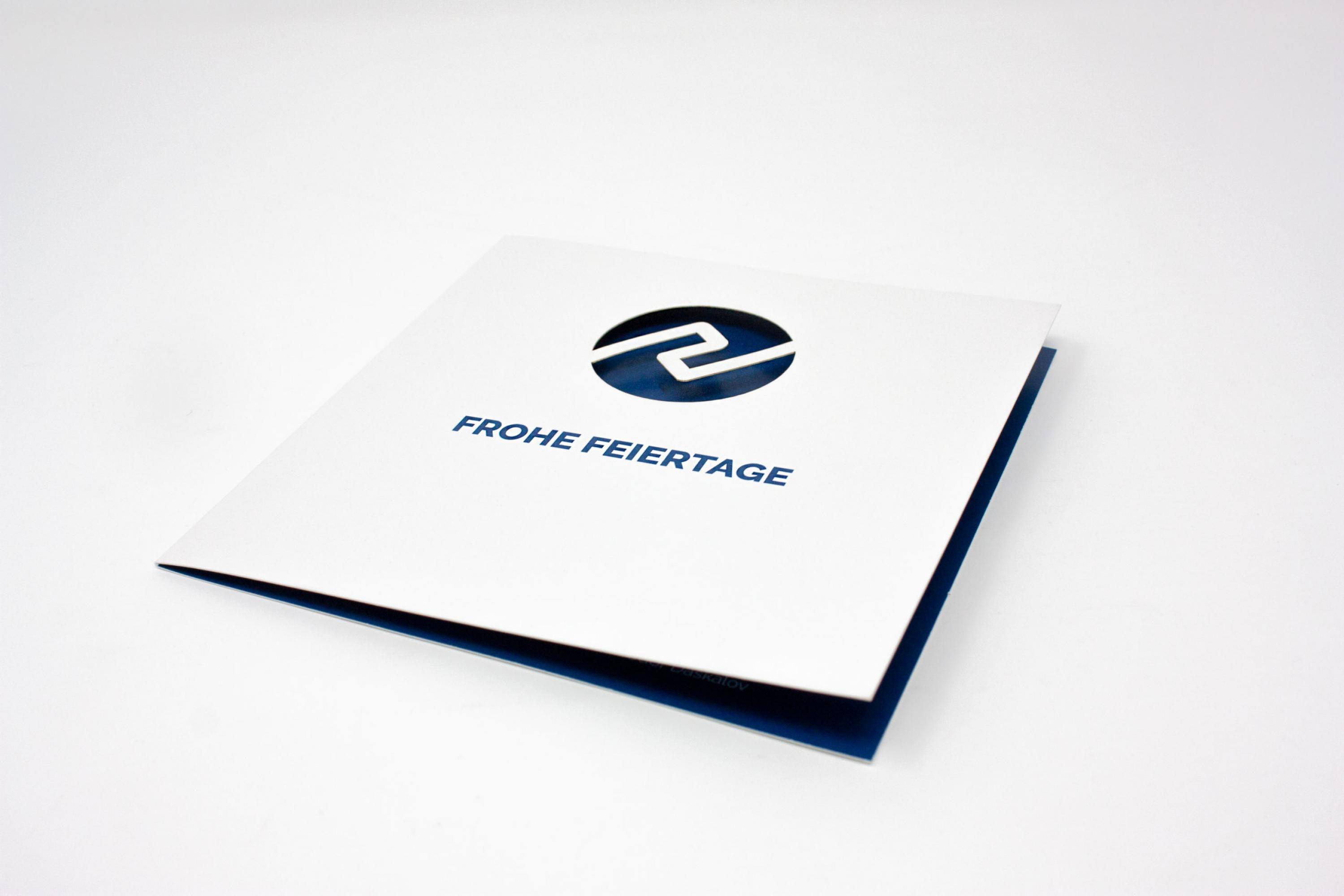
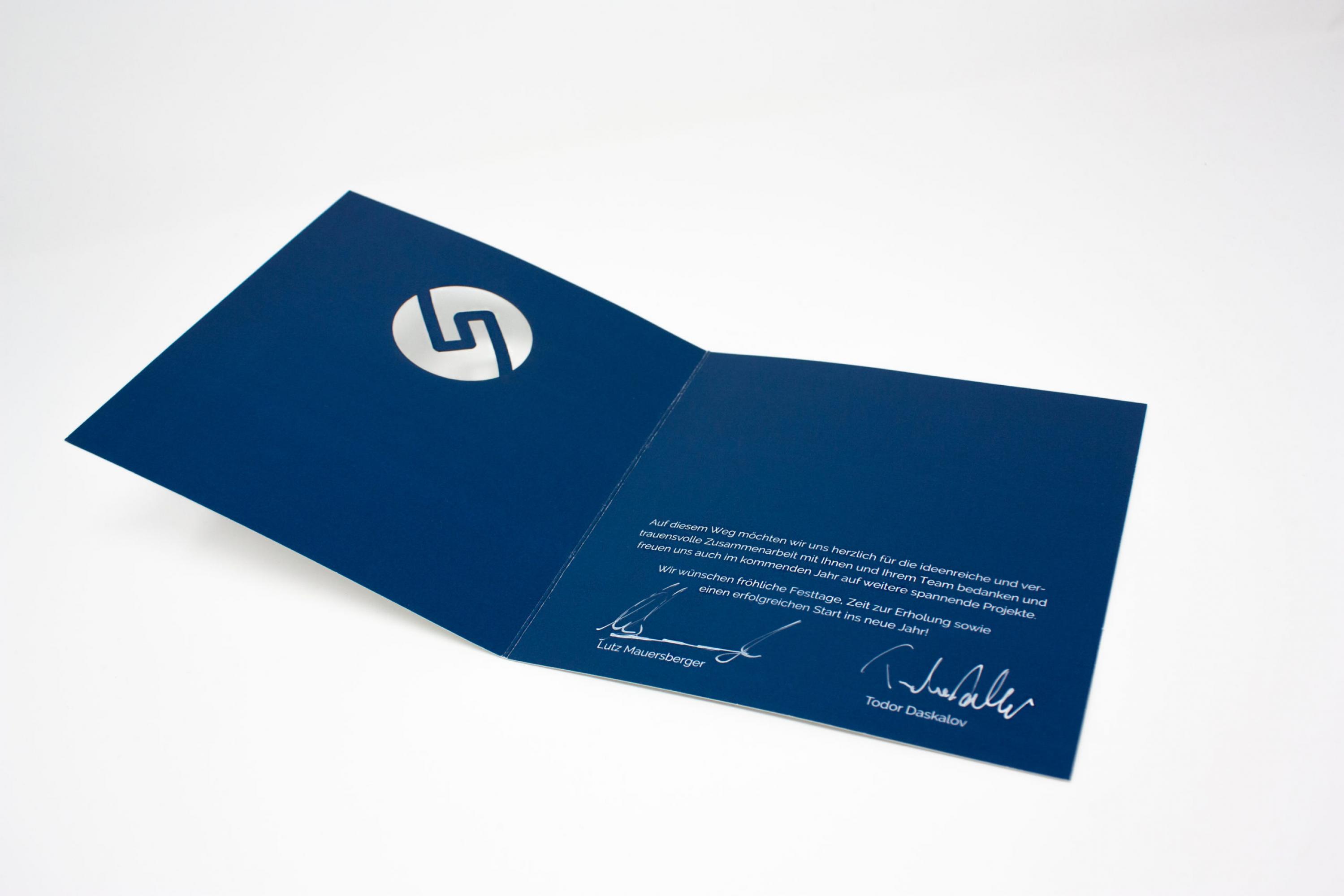
When it comes to Christmas cards or cards for other festive greetings cards, a big challenge is to design a card that fits the company and distributes the greetings appropriately. PROLAN approached us with the wish that the card should stand out from all the other cards that their customers will probably receive during the Advent season.
So we made – this time not using silver or gold foil embossing – a laser cutting of the whole logo. So the card is haptically and optically extraordinary: The logo is only visible through the dark blue print.
